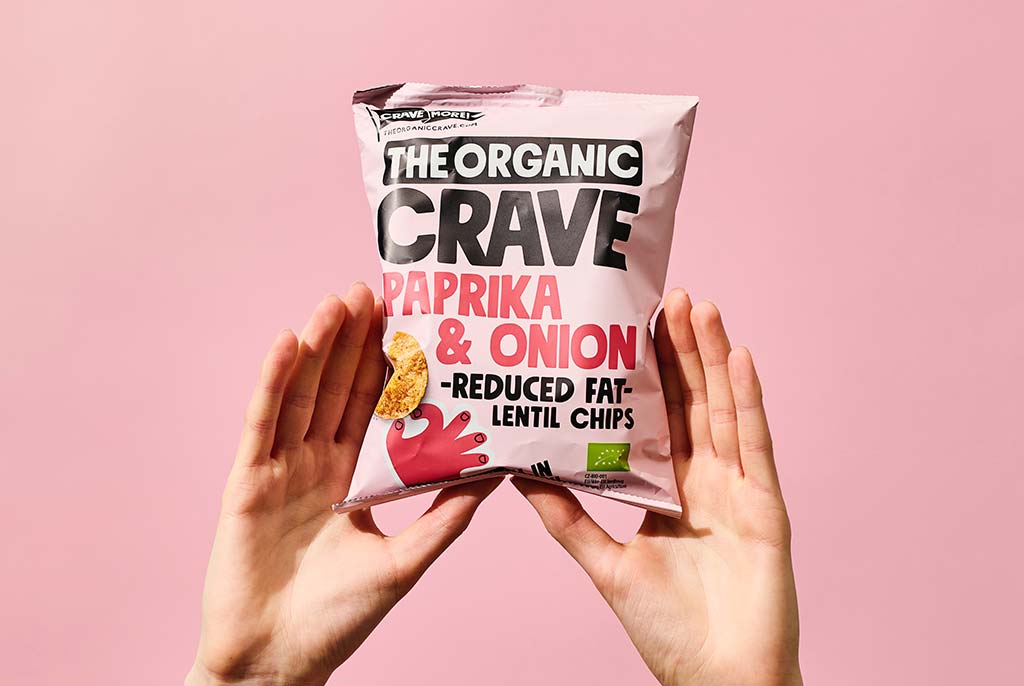
Packaging design has a significant impact on customer impressions of products and purchase choices. A well-designed box may capture attention, express brand values, and improve the whole product experience. Certain packaging design flaws might have the opposite impact, resulting in lower sales and an unfavourable brand reputation. However, with the help of a packaging design agency in Singapore, any unfavourable outcomes can be avoided. In this post, we’ll look at typical package design flaws and how to prevent them.
1. Overcomplicating the Design
Overcomplicating a packaging design is a typical error. Too many pictures, colours, and text might overload customers, making it harder for them to grasp the product or brand message. To minimise misunderstanding, keep the design clean, basic, and focused on the most important selling factors.
2. Bad Branding
Another issue is the failure to express the brand’s identity through packaging properly. Your packaging should clearly communicate your brand’s beliefs, personality, and positioning. Consistent use of brand colours, logos, and messages reinforces brand identification and builds customer trust.
3. Functionality is Lacking
The packaging design should be both aesthetically pleasing and useful. Avoid designing products that are difficult for consumers to open, use, or store. Consider the simplicity of opening, resealability, and product protection during travel and storage.
4. Ignoring Sustainability
In today’s ecologically concerned society, disregarding sustainability in package design is a critical error. Excessive packaging, non-recyclable materials, and single-use plastics can hurt the environment and alienate environmentally sensitive customers. Instead, choose sustainable materials and design solutions that reduce environmental impact.
5. Ineffective Visual Hierarchy
A precise visual hierarchy is necessary to direct consumers’ attention to the most crucial information on the box. Failure to establish a hierarchy may result in critical product information being ignored or misconstrued. Use typeface, colour, and layout to produce a clear and intuitive flow of information.
6. Inconsistent Branding
Consistency is important in branding, especially packaging design. Inconsistencies in branding aspects like colours, typefaces, and graphics can mislead customers and weaken a company’s identity. Ensure that your packaging is consistent with your overall brand style and messaging at all touchpoints.
7. Poor Quality Printing
Low-quality printing can reduce the overall perceived worth of the product and brand. Blurry photos, smeared lettering, or off-colour printing can make the package appear amateurish and inexpensive. Invest in high-quality printing to guarantee that your packaging accurately represents the quality of your goods.
8. Lack of Testing
Failure to test packaging designs with the intended audience is a typical error that can result in missed opportunities and wasted expenditures. Focus groups or surveys may give useful insights into consumer views and preferences, allowing you to tweak packaging design before manufacturing.
Conclusion
Avoiding these frequent package design blunders is critical for developing packaging that successfully communicates your brand’s message, attracts customers, and generates sales. You can create packaging that improves the overall product experience and strengthens your brand by keeping the design simple and focused, ensuring consistent branding, prioritising functionality and sustainability, establishing a clear visual hierarchy, adhering to quality printing standards, and testing with the target audience.
